Pillows, Pillows, Pillows
Brooke Hatfield Design
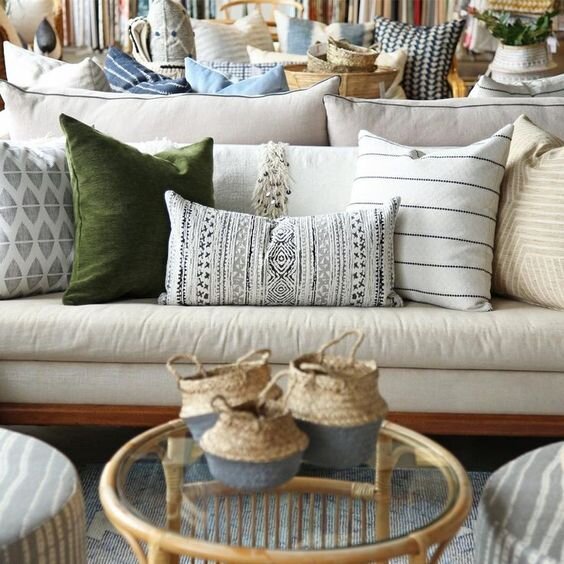
Ok, I admit it. I have a pet peeve about pillows. As I scroll through images on Pinterest or Instagram or some furniture store displays, I come across sofas and beds with real pillow issues. Take this one for example….
In my opinion, there are just too many cushions on this couch. It may look nice for the photograph but the reality of actually living in the space is that if you want to sit down you will likely be putting cushions on the floor. And certainly if more than one person sits on the sofa, cushions will end up on the floor.
On the upside, this photo does show quite well that different scale of pattern and colour can work together as well as different sizes of pillows. Most of the colours are all fairly mid tone colours and have lots of white and cream which helps connect them. That is a unifying element in most of these cushions. Playing with pattern and texture also make this interesting.
FINDING THE PERFECT BALANCE
I like to see two large cushions (one 22”x22” and one 20”x 20”) plus one lumbar cushion (i.e. 12”x20” or 14”x20” or 22”) when working with a regular sized sofa. The larger the sofa or sectional the more cushions it can handle. The opposite is true for a smaller sofa- the smaller the sofa the fewer cushions it can comfortably accommodate.
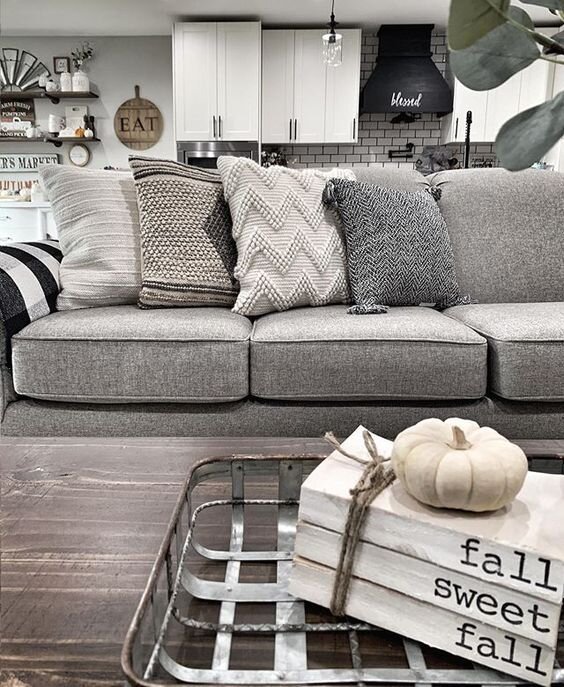
This image has the same issue-too many cushions to make sense. This one does also have a good sense of pattern and colour but just has too much of a good thing.
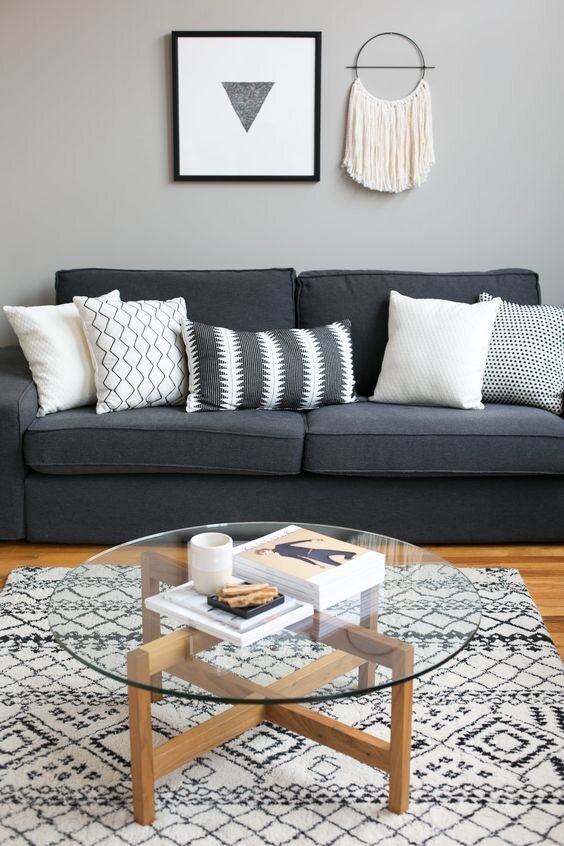
In this picture, the colour and pattern are at play well but they are all the same size. I think it would be more interesting if the cushions were different sizes.
There are also many illustrations that give you a formulaic approach to cushions. I tend to like things a little less calculated. This is a common example of a formulaic approach…
Here is another one that feels formulaic. It just looks a little too contrived to me. I would rather see a more relaxed and personal approach to cushions.
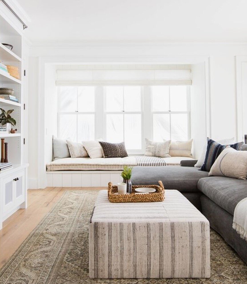
This one feels far more natural and personal to me. I love that the designer here did not put cushions all the way across the window seat. She gave them breathing space and it just makes it way more interesting. She also did not stuff the sofa with too many pillows. I think this is a good example of pillows done well.
Here is another example of cushions done well. What I like about this is, first of all, the jewel tones and sumptuous fabric. It looks like this fabric is likely velvet and it really adds to the sumptuous feel of the jewel tones. Because the back of the sofa is low, the designer has kept the cushions low as well. By the way, what I also like about this image is the very traditional wall treatment combined with the contemporary furniture and art and then the more traditional cushion fabric. But I digress…back to the cushions!
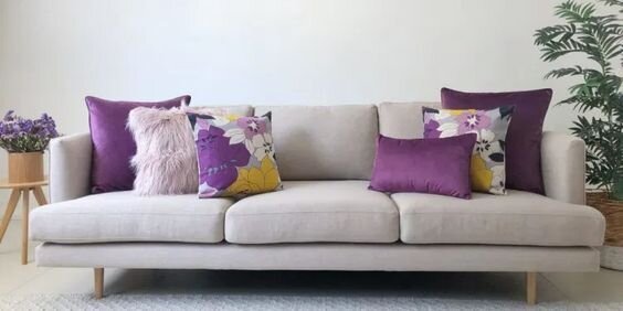
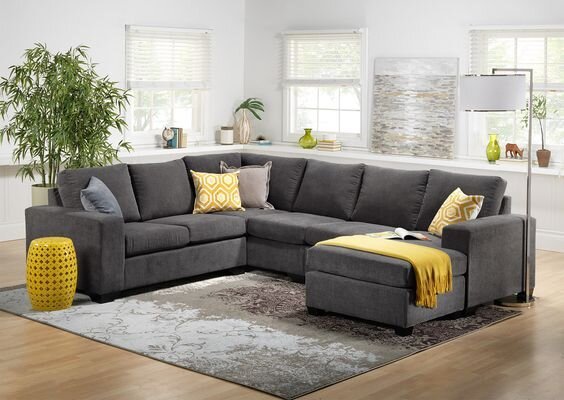
I think this image below is a good example of a display sofa. This image is an advertisement for a sectional. I would probably add a couple of cushions here. On a sofa/sectional so large it is a good opportunity to try some other fabrics and really make it unique. Secondly I would make at least two of the cushions larger. These ones look like they are about 18”x18” which is the standard size cushions that come with ready made sofas. By adding larger (22”x22”) cushions here, it would add quite a bit and make it feel more individuated.
LET’S LOOK AT BEDROOMS!
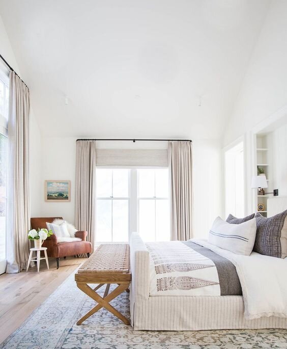
My preference is for fewer, larger cushions on the bed. So many beds in store displays or in magazines, Pinterest or Instagram have a LOT of cushions on the bed. What does a person DO with all those pillows when they want to crawl into bed? Likely they get thrown from the bed and strewn on the floor (at least in my house that is what would happen!) Although this bed looks nice, in my house this just would not be practical.
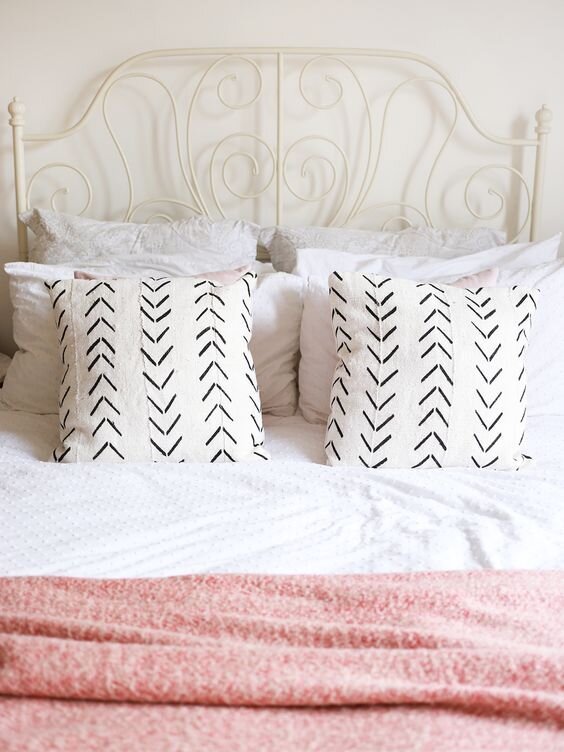
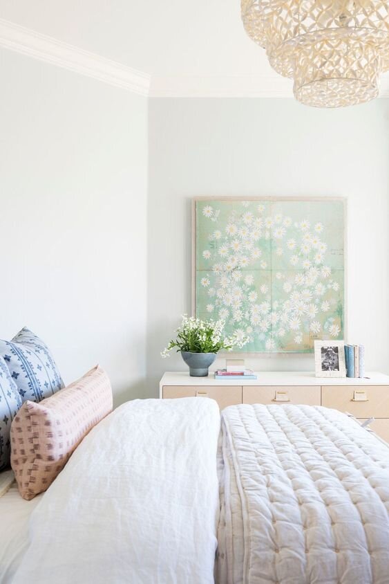
Here is one I like. Just two large cushions. I think this works well on a double or queen bed. Two 20”x20” on a double bed and two 22”x22” on a queen bed and two 24”x24” on a king bed OR a king bed could handle three 22”x22” or three 24”x24” cushions.
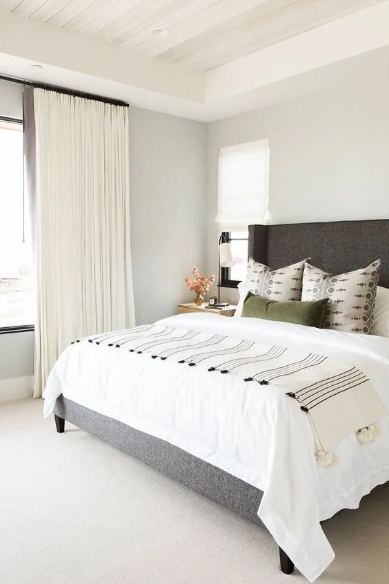
I do like this one below –two large cushions and one lumbar. Easy and yet still looks great.
Here is another example of easy elegance.
And another nice combo without being fussy.
That is probably enough on sizes and numbers of cushions but I will say one other thing. IF you can find feather cushion inserts, use them. They are soft and add another layer of detail that can really add to a space. The standard cushion is polyfil and it stands very erect without the soft lusciousness of feather. Polyfil also flattens over time and generally wears out faster than feather. You will never be disappointed if you use feather.
That about sums up this post for today. I know each designer and each person may have a different perspective. I just urge you to be curious when you are perusing Pinterest. How does this image translate into real life? Does this work for you? By asking yourself these questions it will help you to see beyond the pretty picture and notice how a person may live in the space.
Till next time, happy decorating from Victoria!
“The best rooms have something to say about the people who live in them.”


